Enabling quicker larger uploads to a DAM
Duration:
0-2 years
Creating the UI Library
The UI Library is one of the most essential parts of a design system. We created a scalable, accessible component set, built to ensure brand consistency across all product surfaces.


The Problem
Before our design system, we were experiencing Inconsistent UI elements, slow development cycles and difficulty maintaining accessibility standards. Releasing of features was slow and we were loosing customers to the poor UI design in the product. The product needed a major facelift.
Our Goal
MediaValet needed be upgraded from Angular to React, with that it felt like the right time to create a component library that would be built and maintained in React to be recycled throughout the product. Furthermore it would establish a single source of truth for design and development, reducing time-to-market for new features by and ensuring WCAG AA compliance.

Design Foundations
Using foundational tokens; such as text, padding, radius, and spacing, allowed us to manage the entire UI from a single source. In this example we see how we outlined the use of desktop and mobile text tokens. This helped us to ensure consistent text across the different breakpoints.
Component Examples
Buttons
The Button component includes 10 variants (Primary, Secondary, Text, Destructive) across 3 sizes, all supporting loading, disabled, and hover states. This level of granularity prevents developers from creating custom one-off styles.


Line items
Line items are one of the most commonly used components in the system. Many different variants were needed for different features across the product. These were designed using our foundational tokens such as our padding tokens (4px, 8px, 12px), helped us to ensure consistent vertical and horizontal rhythm.
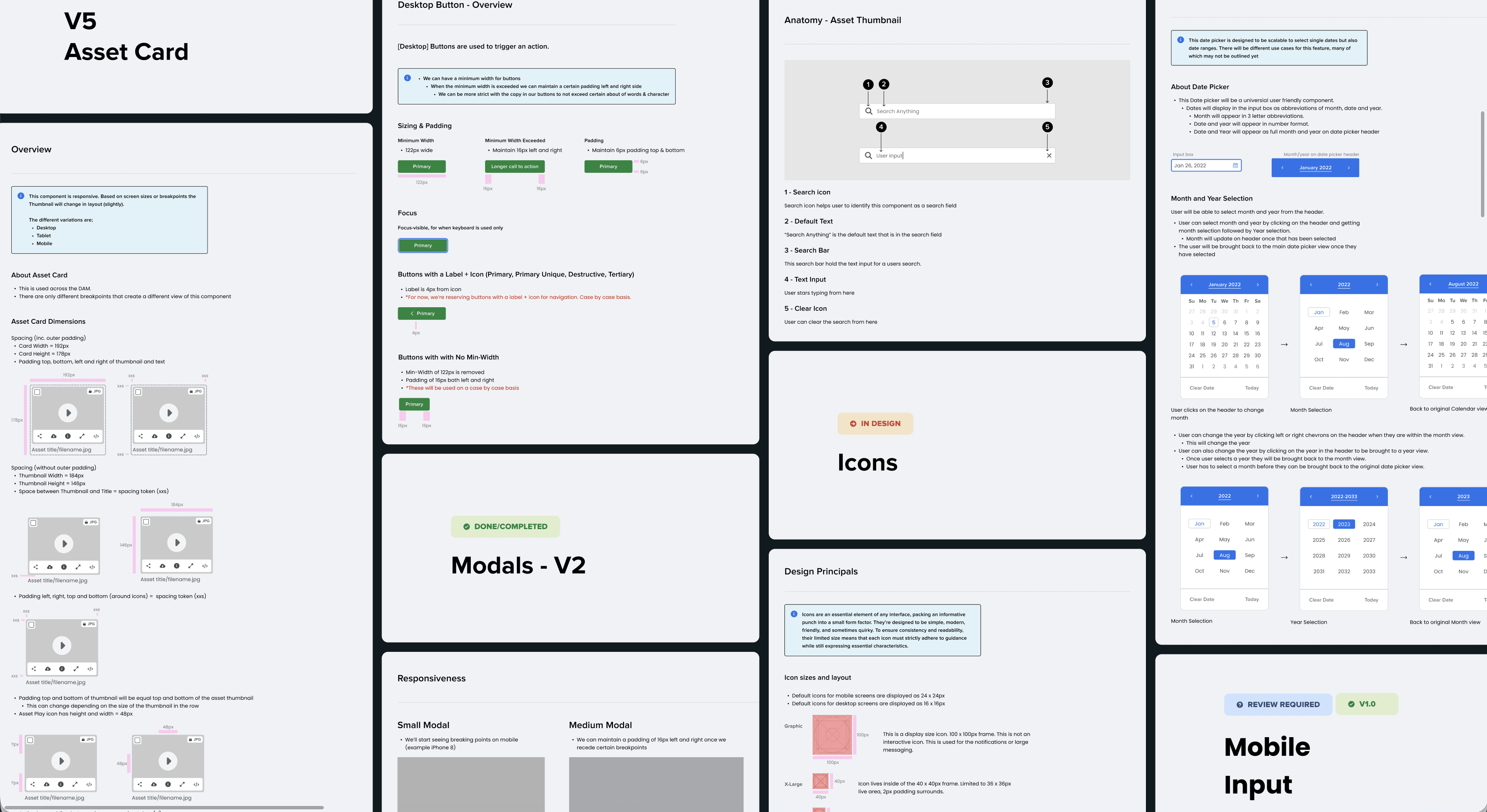
Icons
Icons are created specially to suit the needs of the DAM. There are 5 different sizes used across the system (40px, 32px, 24px, 16px, 10px). Consistency in the size of the component ensures that they can be reused and fitted to the spacing and padding guidelines established. They are of industry standard and designed to enhance users understanding of the product.

Conclusion
It took 2 years to complete the design system. It was on ongoing effort to create a cohesive component library that could be used time and time again. With newer and improved features and tools, more components can be added more swiftly to the collection. However the basic tokens have been critical in forming the DAM as we know it today.